

Introduction – Why This Matters
In my experience, there’s a moment that every website owner eventually faces. They’re reviewing their analytics, and they notice something startling: the majority of their traffic is coming from mobile devices. Sometimes it’s 60%, sometimes 70%, sometimes even more. And yet, they’ve been designing and optimizing their site while sitting at a desktop computer, thinking about desktop users.
What I’ve found is that this disconnect—between how we build sites and how users actually access them—is one of the biggest missed opportunities in SEO. Mobile users are not just “desktop users on a smaller screen.” They’re different. They’re often on the go. They have different intents. They search differently (more voice, more “near me,” more conversational). And perhaps most importantly, Google now evaluates your site primarily based on its mobile version—a concept called mobile-first indexing.
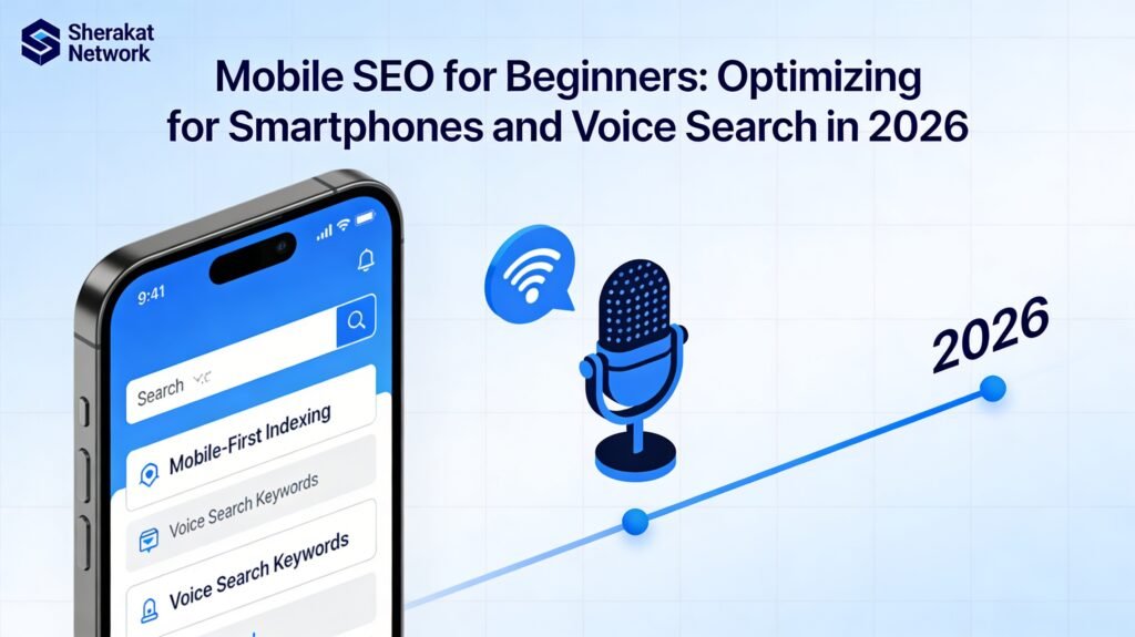
Here’s the reality: In 2026, mobile devices account for over 60% of all web traffic globally. For many niches, that number is even higher. Google has been using mobile-first indexing for years, meaning it crawls and indexes the mobile version of your site first. If your mobile site is slow, hard to use, or missing content that’s on your desktop site, your rankings will suffer—even for desktop users.
But mobile SEO isn’t just about making your site fit on a smaller screen. It’s about understanding how mobile behavior differs. Mobile users are more likely to:
- Use voice search (“Hey Siri, find a coffee shop near me”).
- Search for local businesses (“plumber open now”).
- Expect fast-loading pages (53% abandon if it takes over 3 seconds).
- Take immediate action (call, get directions, visit a store).
In this guide, we’re going to cover everything you need to know about mobile SEO in 2026. We’ll start with the foundation—mobile-first indexing and responsive design. Then we’ll dive into mobile page speed, voice search optimization, local mobile SEO, and the technical elements that make or break the mobile experience. By the end, you’ll have a complete roadmap for ensuring your site is ready for the mobile-dominated future.
Background / Context
To understand mobile SEO, we need to look at how mobile search has evolved. In the early days of smartphones (late 2000s), mobile websites were often afterthoughts—stripped-down versions of desktop sites with “m.” subdomains. They were hard to navigate and often missing key content.
Then came the explosion of smartphones, particularly the iPhone and Android devices. By 2015, mobile searches exceeded desktop searches in many countries. Google responded with a series of mobile-focused algorithm updates. The most significant was Mobilegeddon in 2015, which boosted rankings for mobile-friendly sites.
But the biggest shift came with mobile-first indexing, which Google began rolling out in 2018 and completed in the early 2020s. Before this, Google primarily used the desktop version of a site for indexing and ranking. With mobile-first indexing, Googlebot now crawls and indexes the mobile version of your site first. If your mobile site is missing content that’s on your desktop site, that content won’t be indexed.
Around the same time, voice search began to take off. With the proliferation of smart speakers (Amazon Echo, Google Home) and voice assistants on every smartphone, people started searching differently. Instead of typing “weather London,” they’d say “Hey Google, what’s the weather like in London today?” Voice searches are longer, more conversational, and often have local intent.
Today, in 2026, mobile and voice search are deeply intertwined. Google’s algorithms are sophisticated enough to understand natural language queries and deliver relevant results. Features like featured snippets (position zero) have become even more important because they’re often read aloud by voice assistants.
Mobile SEO also intersects heavily with the technical SEO and local SEO principles you’ve already learned. Page speed, Core Web Vitals, and mobile usability are all technical factors. Local intent is amplified on mobile, with “near me” searches driving foot traffic to local businesses.
Key Concepts Defined
Before we dive into the how-to, let’s establish the key vocabulary of mobile SEO.
- Mobile-First Indexing: Google’s practice of using the mobile version of a website for indexing and ranking. If your mobile site is missing content that’s on your desktop site, that content won’t be indexed.
- Responsive Design: A web design approach where a single website automatically adjusts its layout and content to fit any screen size (desktop, tablet, mobile). This is Google’s recommended design pattern.
- Dynamic Serving: A setup where the server delivers different HTML/CSS code based on the user’s device (same URL, different code). More complex than responsive design, but can be effective.
- Separate Mobile URLs (m. subdomain) : An older approach where mobile users are sent to a separate URL like
m.example.com. This is now generally discouraged because it creates maintenance headaches and duplicate content issues. - Viewport: The visible area of a web page on a device. Proper viewport configuration (using the viewport meta tag) ensures your site scales correctly on mobile devices.
- Mobile Usability: How easy it is for users to interact with your site on a mobile device. Factors include text size, button spacing, and the absence of horizontal scrolling.
- Core Web Vitals: A set of specific metrics Google uses to measure user experience, including loading (LCP), interactivity (INP), and visual stability (CLS). These are especially critical on mobile, where connections are slower.
- Largest Contentful Paint (LCP): Measures loading performance. For mobile, you want LCP to occur within 2.5 seconds of page load.
- Interaction to Next Paint (INP): Measures a page’s responsiveness to user interactions. Aim for under 200 milliseconds.
- Cumulative Layout Shift (CLS): Measures visual stability. A low score (under 0.1) means elements don’t shift around while loading, preventing accidental taps.
- Accelerated Mobile Pages (AMP): A Google-backed project to create ultra-fast loading mobile pages by stripping down HTML. While still used in some contexts (news, email), AMP is less critical than it once was, as Core Web Vitals have become the standard.
- Voice Search: Searching by speaking rather than typing. Voice queries tend to be longer, more conversational, and often question-based.
- Featured Snippet (Position Zero): The highlighted box at the top of some search results that directly answers a query. Voice assistants often read featured snippets aloud.
- Near Me Searches: Searches with local intent, often performed on mobile. Example: “pizza near me.” Optimizing for these is crucial for local businesses.
- Thumb-Friendly Design: Designing interfaces so that important elements (buttons, links) are within easy reach of a user’s thumb on a mobile device.
- Progressive Web App (PWA): A type of application built with web technologies that can be installed on a device and work offline. PWAs can offer a superior mobile experience.
How It Works (Step-by-Step Breakdown)
Mobile SEO requires a systematic approach to design, speed, content, and technical implementation. Here’s a step-by-step breakdown.
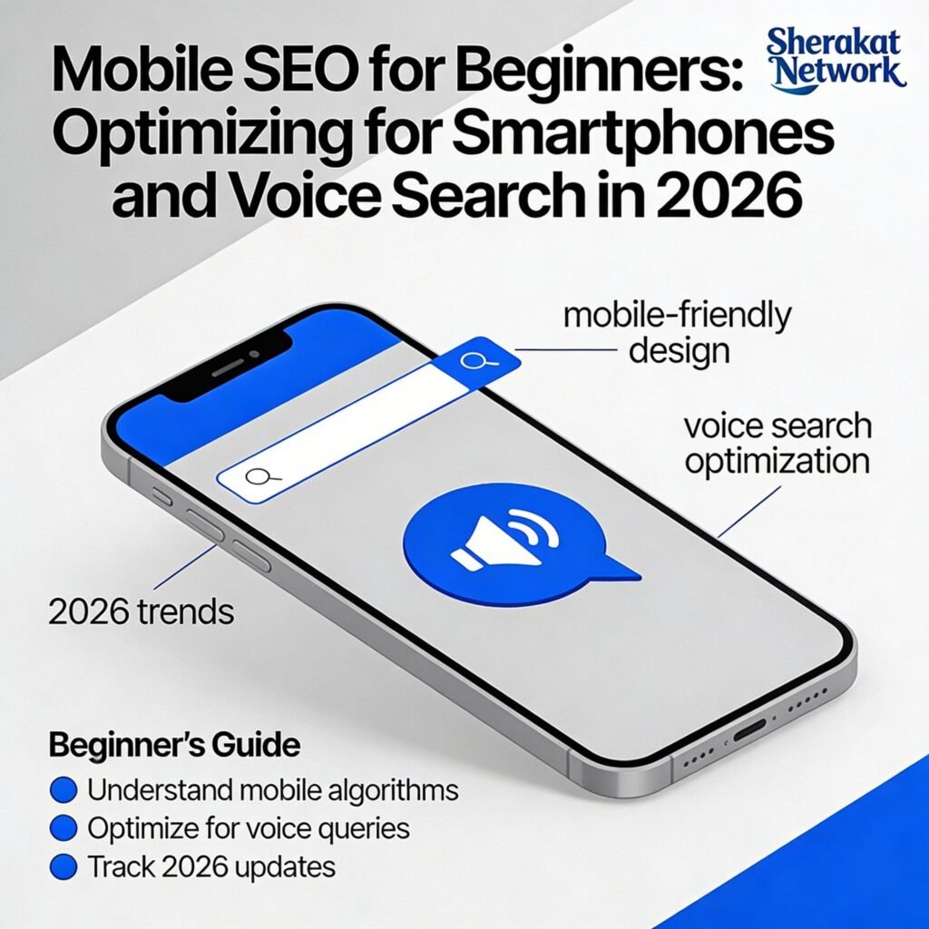
Step 1: Ensure Your Site Uses a Mobile-Friendly Configuration
The first step is choosing how your site will handle mobile users. Google strongly recommends responsive design—a single site that adapts to any screen size. It’s the easiest to implement and maintain, and it avoids the duplicate content issues of separate mobile URLs.
How to check your current setup:
- Use Google’s Mobile-Friendly Test: Enter your URL, and it will tell you if your page is mobile-friendly and highlight any issues.
- Check your viewport configuration: In your site’s HTML source, look for the viewport meta tag:
<meta name="viewport" content="width=device-width, initial-scale=1">. This tells browsers how to scale your page. - Test on real devices: If possible, view your site on actual smartphones (both iOS and Android). Check navigation, button sizes, and readability.
If you’re using separate mobile URLs (m.example.com):
- Consider migrating to responsive design. The maintenance overhead of separate URLs is significant.
- If you must keep separate URLs, ensure you’re using the correct canonical and alternate tags to indicate the relationship between desktop and mobile versions.
Step 2: Optimize for Mobile Page Speed
Page speed is critical on mobile, where connections are often slower, and users are less patient. Google’s Core Web Vitals are ranking factors, and mobile speed is a key component.
How to check mobile speed:
- Google PageSpeed Insights: Enter your URL and it will give you a mobile speed score along with specific recommendations.
- Google Search Console: Check the Core Web Vitals report to see which pages need attention.
- GTmetrix: Another excellent tool for detailed performance analysis.
Common mobile speed optimizations:
- Optimize images: This is the biggest win for most sites. Compress images using tools like TinyPNG or ShortPixel. Use next-gen formats like WebP. Implement lazy loading so images load only as users scroll down.
- Minimize code: Minify CSS, JavaScript, and HTML by removing unnecessary characters. Many caching plugins can do this automatically.
- Leverage browser caching: Set expiration dates for static resources so returning visitors load your site faster.
- Use a Content Delivery Network (CDN): CDNs store copies of your site on servers around the world, delivering content from the server closest to the user.
- Reduce redirects: Each redirect adds additional load time. Minimize them where possible.
- Eliminate render-blocking resources: Identify and defer JavaScript and CSS that prevent your page from loading quickly.
- Choose fast hosting: Your hosting provider matters. Shared hosting may be cheap, but it’s often slow. Consider upgrading to a faster solution.
Step 3: Master Core Web Vitals
Core Web Vitals are specific metrics that Google uses to measure user experience. They’re especially important on mobile.
The three Core Web Vitals:
- Largest Contentful Paint (LCP): Measures loading speed. Target 2.5 seconds or less. Common fixes: optimize images, improve server response time, and remove render-blocking scripts.
- Interaction to Next Paint (INP): Measures responsiveness. Target 200 milliseconds or less. Common fixes: minimize JavaScript execution time, break up long tasks, optimize event handlers.
- Cumulative Layout Shift (CLS): Measures visual stability. Target 0.1 or less. Common fixes: specify width and height for images and videos, reserve space for ads and embeds, and avoid inserting content above existing content unless in response to user interaction.
How to improve Core Web Vitals:
- Use PageSpeed Insights to identify specific issues.
- Work with your developer to implement fixes.
- Monitor your progress in Google Search Console’s Core Web Vitals report.
Step 4: Optimize for Mobile Usability
Beyond speed, your site needs to be genuinely usable on a mobile device. Google’s mobile usability report in Search Console identifies common issues.
Mobile usability checklist:
- Text size: Text should be readable without zooming. Aim for at least 16px font size for body text.
- Button and link spacing: Buttons and links should be large enough to tap easily (at least 48×48 pixels recommended) and spaced far enough apart to prevent accidental taps.
- No horizontal scrolling: Content should fit within the screen width. Users shouldn’t have to scroll sideways.
- Avoid intrusive interstitials: Pop-ups that cover the main content can frustrate mobile users and may be penalized by Google. If you must use pop-ups, make them easy to dismiss.
- Clickable elements close together: Ensure elements are not too close, preventing mis-taps.
- Viewport configured correctly: As mentioned earlier, the viewport meta tag should be present and properly set.
Step 5: Optimize Content for Mobile Users
Mobile users consume content differently. They scan more, have shorter attention spans, and often have different intents.
Mobile content best practices:
- Use short paragraphs: Walls of text are daunting on a small screen. Break content into short, scannable paragraphs.
- Use subheadings generously: Clear H2s and H3s help users find what they’re looking for quickly.
- Bullet points and lists: These are easier to scan than dense paragraphs.
- Front-load important information: Put the most critical information at the top. Mobile users may not scroll all the way down.
- Use clear, concise language: Every word should earn its place.
- Optimize for “micro-moments”: Mobile users often have immediate needs—”I need to know,” “I want to go,” “I want to buy.” Structure your content to address these moments.
Step 6: Optimize for Voice Search
Voice search is primarily a mobile behavior. People use voice when their hands are occupied—driving, cooking, walking. Optimizing for voice requires a different approach.
Voice search optimization strategies:
- Target question-based keywords: People ask questions when using voice. Use tools like AnswerThePublic to find common questions in your niche. Create content that directly answers these questions.
- Optimize for featured snippets: Voice assistants often read the featured snippet (position zero) as the answer to a question. Structure your content to win these snippets by providing clear, concise answers to common questions.
- Use natural, conversational language: Write the way people speak. Instead of “best plumber Austin,” think “who’s the best plumber in Austin?” or “how do I find a reliable plumber near me?”
- Create FAQ pages: FAQ pages are perfect for voice search. They directly address questions in a structured format.
- Optimize for local intent: Many voice searches are local: “where’s the nearest coffee shop?” Ensure your local SEO is strong, with a complete Google Business Profile and local citations.
- Focus on long-tail keywords: Voice searches are longer and more specific than typed searches. Target these long-tail variations.
Step 7: Optimize for Local Mobile Search
Mobile and local are inseparable. People use their phones to find businesses nearby, often with the immediate intent to visit or buy.
Local mobile SEO strategies:
- Complete your Google Business Profile: This is essential. Ensure your profile is fully filled out with accurate hours, photos, and attributes.
- Optimize for “near me”: Include phrases like “near me” and “in [city]” in your content and metadata.
- Encourage and respond to reviews: Positive reviews on Google and other platforms boost local visibility.
- Ensure NAP consistency: Your name, address, and phone number must be identical across your website and all directories.
- Create location-specific content: Blog posts about local events, guides to local attractions, etc.
- Add click-to-call buttons: Make it easy for mobile users to call you directly from search results or your website.
Step 8: Address Technical Mobile Issues
Beyond speed and usability, there are technical considerations specific to mobile.
Technical mobile SEO checklist:
- Check for blocked resources: Ensure your mobile site isn’t blocking Googlebot from accessing CSS, JavaScript, or images. In Google Search Console, use the URL inspection tool to see how Google renders your mobile pages.
- Avoid intrusive interstitials: Google penalizes sites that use pop-ups that make content inaccessible on mobile.
- Handle mobile redirects carefully: If you use separate mobile URLs, ensure redirects are correct and don’t create redirect chains.
- Test on multiple devices: Use browser developer tools to simulate different devices, but also test on real hardware.
- Monitor mobile indexing in Google Search Console: Check the “Pages” report under Indexing to see how many mobile pages are indexed.
- Ensure parity between mobile and desktop content: With mobile-first indexing, your mobile site must contain the same important content as your desktop site. Don’t hide content on mobile.
Step 9: Create a Mobile-First Content Strategy
Given that most users will see your mobile version first, consider adopting a “mobile-first” mindset for content creation.
Mobile-first content principles:
- Start with the core message: What’s the one thing you want mobile users to take away? Lead with that.
- Design for scrolling: Mobile users are comfortable scrolling. Don’t try to cram everything above the fold.
- Use progressive disclosure: Reveal information gradually as users need it. Tabs, accordions, and “read more” sections can keep pages clean while still providing depth.
- Optimize forms for mobile: Keep forms short on mobile. Use appropriate input types (e.g., number pad for phone numbers).
- Test on mobile before publishing: Always preview your content on a mobile device before hitting publish.
Step 10: Measure Mobile SEO Performance
Use the measurement techniques you’ve already learned, with a focus on mobile-specific metrics.
Key mobile SEO metrics to track:
- Mobile traffic percentage: What portion of your total traffic comes from mobile devices?
- Mobile bounce rate and engagement: Compare mobile vs. desktop engagement. Higher mobile bounce rates may indicate mobile usability issues.
- Mobile conversion rate: Are mobile users converting at the same rate as desktop users? If not, investigate.
- Core Web Vitals: Monitor your Core Web Vitals reports in Google Search Console, segmented by device.
- Mobile rankings: Track rankings for mobile searches separately if possible. Some tools allow device-specific rank tracking.
- Mobile usability issues: Check Google Search Console’s Mobile Usability report regularly.
- Voice search traffic: This is harder to track directly, but you can infer it by monitoring question-based keyword performance and featured snippet wins.
Why It’s Important
Mobile SEO isn’t a nice-to-have—it’s essential for survival in today’s search landscape.
- It’s How Google Evaluates Your Site: With mobile-first indexing, Google uses your mobile site for ranking. If your mobile experience is poor, your rankings will suffer, even for desktop users.
- It’s Where Your Users Are: Over 60% of web traffic is mobile. Ignoring mobile means ignoring the majority of your potential audience.
- Mobile Users Have High Expectations: They expect fast, smooth experiences. 53% abandon sites that take over 3 seconds to load. A poor mobile experience drives users to competitors.
- Voice Search is Growing: Voice search is primarily mobile. Optimizing for voice opens up a growing channel of traffic.
- Local Intent is Mobile: “Near me” searches almost always happen on mobile. For local businesses, mobile SEO is directly tied to foot traffic and revenue.
- It Impacts User Experience and Trust: A site that’s hard to use on mobile feels outdated and untrustworthy. Good mobile UX builds trust with your audience.
Sustainability in the Future
Mobile SEO will continue to evolve. Here’s what the future looks like.
- 5G and Beyond: Faster mobile networks will enable richer experiences, but they’ll also raise user expectations. Sites will need to deliver even more sophisticated content while maintaining speed.
- AI-Powered Personalization: Search results may become more personalized based on mobile user behavior and context. Building a strong brand and loyal audience will be increasingly important.
- Augmented Reality (AR) Search: AR features (like pointing your phone at a product to see reviews) may become search results. Optimizing for visual and AR search will be a new frontier.
- Wearable Search: Smartwatches and other wearables present new search interfaces with even smaller screens. Optimizing for these devices may become relevant.
- Continued Focus on User Experience: Google’s emphasis on user experience (Core Web Vitals, mobile usability) will only intensify. Sites that prioritize users will be rewarded.
Common Misconceptions
Let’s clear up some myths that can derail your mobile SEO efforts.
- Myth: “Mobile SEO is just about making my site responsive.”
- Reality: Responsive design is the foundation, but mobile SEO encompasses speed, Core Web Vitals, mobile usability, voice search, local optimization, and content strategy. It’s much more than just layout.
- Myth: “Mobile users are just desktop users on smaller screens.”
- Reality: Mobile users have different intents, behaviors, and expectations. They’re often on the go, have shorter attention spans, and are more likely to take immediate action (call, visit). They need to be treated differently.
- Myth: “If my desktop site is fast, my mobile site will be fast too.”
- Reality: Mobile connections are often slower and less reliable than desktop. A site that loads quickly on fast Wi-Fi may be painfully slow on cellular. You must test and optimize specifically for mobile conditions.
- Myth: “I don’t need to worry about mobile because my audience is mostly desktop.”
- Reality: Even if your analytics show mostly desktop traffic, mobile-first indexing means Google still evaluates your site based on the mobile version. A poor mobile site can hurt your desktop rankings.
- Myth: “Voice search optimization is a completely separate thing.”
- Reality: Voice search optimization overlaps heavily with regular SEO—it’s about understanding user intent, answering questions, and providing clear, structured content. It’s an extension of good SEO, not a replacement.
- Myth: “I can hide content on mobile to make it cleaner.”
- Reality: With mobile-first indexing, if you hide important content on mobile, it may not be indexed at all. Ensure parity between mobile and desktop content.
Recent Developments
Mobile SEO in 2026 is shaped by several key developments.
- INP Has Replaced FID: Google’s Core Web Vitals now use Interaction to Next Paint (INP) instead of First Input Delay (FID). INP measures overall responsiveness, which is critical for mobile interactions.
- Enhanced Mobile Usability Reports: Google Search Console now provides more detailed mobile usability reports, including specific issues like “clickable elements too close” and “text too small to read.”
- Voice Search Continues to Grow: Smart speaker adoption has plateaued in some markets, but voice search on mobile continues to grow, especially among younger users. Optimizing for conversational queries remains important.
- Visual Search Integration: Google Lens is now deeply integrated into search, allowing users to search with their camera. For e-commerce sites, this makes image optimization even more critical.
- Core Web Vitals Become Standard: Core Web Vitals are now a well-established ranking factor, and tools for measuring and improving them have become more sophisticated.
Success Stories
The E-Commerce Site That Doubled Mobile Conversions
A few years ago, I worked with an online clothing retailer. Their desktop site was beautiful and converted well. But their mobile site was a disaster—slow, hard to navigate, with tiny buttons and text. Mobile users were bouncing at an alarming rate, and mobile conversions were a fraction of desktop.
We conducted a thorough mobile audit and implemented changes:
- Switched to a responsive design (they had been using separate mobile URLs).
- Compressed all product images and implemented lazy loading.
- Simplified navigation for mobile (hamburger menu, clear categories).
- Increased font sizes and button spacing.
- Implemented click-to-call and easier checkout.
Within three months, mobile page speed improved by 60%, mobile bounce rate dropped by 35%, and mobile conversions increased by 120%. Their overall organic traffic grew because Google’s mobile-first indexing now saw a healthy mobile site. They didn’t just fix mobile—they transformed their business.
The Local Restaurant That Won with Voice Search
A family restaurant in a busy neighborhood was struggling to attract new customers. They had a decent website, but they weren’t showing up for “near me” searches.
We optimized their local SEO first—complete Google Business Profile, consistent NAP, local citations. Then we focused on voice search. We created an FAQ page answering common questions: “What are your hours?” “Do you have outdoor seating?” “Is there parking nearby?” “Do you take reservations?” We structured the answers to be clear and concise—perfect for featured snippets.
Within months, they started appearing in voice search results. When someone asked “Hey Google, find an Italian restaurant near me with outdoor seating,” their restaurant was often the answer. Foot traffic from new customers increased significantly, all because they optimized for how mobile users actually search.
Real-Life Examples
Example 1: The Mobile-Friendly Test
Scenario: A local plumbing company’s website looks fine on desktop but fails Google’s Mobile-Friendly Test.
The issues identified:
- Text too small to read (10px font on mobile).
- Clickable elements too close together (links in the navigation overlap).
- Viewport not set (page doesn’t scale properly).
The fixes:
- Increase base font size to 16px.
- Add padding between navigation links and increase tap target size.
- Add proper viewport meta tag:
<meta name="viewport" content="width=device-width, initial-scale=1">.
Result: The site passes the mobile-friendly test, provides a better user experience, and meets Google’s baseline requirements for mobile usability.
Example 2: Core Web Vitals Optimization
Scenario: A content website has poor Core Web Vitals scores on mobile, particularly LCP (loading) and CLS (layout shift).
The issues identified:
- Large, unoptimized hero image (LCP issue).
- Ads loading and shifting content after page load (CLS issue).
- Render-blocking JavaScript delaying page display.
The fixes:
- Compress the hero image and convert to WebP format.
- Reserve space for ads so they don’t shift content when loaded.
- Defer non-critical JavaScript.
- Implement lazy loading for images below the fold.
Result: LCP improves from 4.2 seconds to 2.1 seconds. CLS improves from 0.25 to 0.05. The site passes Core Web Vitals assessment, and rankings improve.
Example 3: Voice Search Optimization
Scenario: A financial advisor wants to appear in voice search results for questions about retirement planning.
The approach:
- Research common voice search queries using AnswerThePublic and “People also ask” boxes: “How much do I need to retire?” “When should I start saving for retirement?” “What’s the best retirement account?”
- Create a dedicated FAQ page answering each question clearly and concisely.
- Structure answers to be featured snippet-friendly: direct answer in a paragraph, followed by more detail.
- Use natural, conversational language throughout.
Result: The FAQ page earns several featured snippets. When users ask voice assistants these questions, the financial advisor’s answers are read aloud, driving traffic and establishing authority.
Conclusion and Key Takeaways
Mobile SEO is no longer a separate discipline—it’s an integral part of how Google evaluates and ranks websites. With mobile-first indexing, your mobile site is your primary site in Google’s eyes. With voice search growing, how people search on mobile is changing. And with mobile users expecting fast, seamless experiences, technical performance has never been more important.
You’ve now built a complete SEO foundation across ten comprehensive guides. You understand the fundamentals. You can research keywords. You know how to optimize pages. You can fix technical issues. You understand link building and E-E-A-T. You can measure success. You know how to dominate local search. You can optimize e-commerce sites. And now, you understand the mobile-first world we live in.
Key Takeaways:
- Mobile-first indexing is the standard. Google uses your mobile site for ranking. Ensure your mobile site contains all important content.
- Responsive design is Google’s recommended approach. It’s simpler to maintain and avoids duplicate content issues.
- Page speed is critical on mobile. Optimize images, minimize code, leverage caching, and use a CDN. Monitor Core Web Vitals.
- Mobile usability matters. Use readable font sizes, adequate button spacing, and avoid intrusive interstitials. Test with Google’s Mobile-Friendly Test.
- Voice search is growing. Optimize for question-based keywords, target featured snippets, use natural language, and create FAQ pages.
- Local and mobile are inseparable. Complete your Google Business Profile, optimize for “near me,” and encourage reviews.
- Ensure content parity. Don’t hide important content on mobile—it won’t be indexed.
- Measure mobile performance separately. Track mobile traffic, engagement, conversions, and Core Web Vitals.
Remember, mobile users are not a secondary audience—they are often your primary audience. By optimizing for mobile, you’re not just satisfying Google’s algorithms; you’re providing a better experience for the majority of your visitors. And in the end, that’s what good SEO is all about.
FAQs (Frequently Asked Questions)
1. What is mobile-first indexing?
Mobile-first indexing means Google primarily uses the mobile version of a website for indexing and ranking. If your mobile site is missing content that’s on your desktop site, that content won’t be indexed.
2. How do I know if my site is mobile-friendly?
Use Google’s Mobile-Friendly Test tool. Enter your URL, and it will analyze your page and report any mobile usability issues.
3. What is responsive design?
Responsive design is a web design approach where a single website automatically adjusts its layout and content to fit any screen size (desktop, tablet, mobile). It’s Google’s recommended design pattern.
4. What are Core Web Vitals?
Core Web Vitals are a set of specific metrics Google uses to measure user experience: Largest Contentful Paint (LCP – loading), Interaction to Next Paint (INP – interactivity), and Cumulative Layout Shift (CLS – visual stability).
5. How fast should my mobile site load?
For a good user experience, aim for LCP under 2.5 seconds. More broadly, 53% of mobile users abandon sites that take longer than 3 seconds to load.
6. How do I improve mobile page speed?
Optimize images, minify CSS/JavaScript, leverage browser caching, use a CDN, reduce redirects, and choose fast hosting. Use PageSpeed Insights for specific recommendations.
7. What is voice search SEO?
Voice search SEO is the practice of optimizing your content for spoken queries. Voice searches tend to be longer, more conversational, and question-based. Optimizing for featured snippets is a key strategy.
8. How do I optimize for voice search?
Target question-based keywords, create FAQ pages, aim for featured snippets, use natural language, and optimize for local intent.
9. What is a featured snippet?
A featured snippet (position zero) is a highlighted box at the top of some search results that directly answers a query. Voice assistants often read featured snippets aloud.
10. How does mobile SEO relate to local SEO?
Mobile and local are deeply connected. Most “near me” searches happen on mobile. A strong local SEO foundation is essential for mobile success.
11. What is the viewport meta tag?
It’s a line of HTML that tells browsers how to scale your page on different devices. It should look like: <meta name="viewport" content="width=device-width, initial-scale=1">.
12. What font size should I use on mobile?
Body text should be at least 16px to be readable without zooming. Headings can be larger.
13. How big should buttons be on mobile?
Buttons and links should be at least 48×48 pixels with adequate spacing to prevent accidental taps.
14. What are intrusive interstitials?
They’re pop-ups that cover the main content, making it hard for users to access what they came for. Google may penalize sites that use them, especially on mobile.
15. Should I hide content on mobile to make the page cleaner?
No. With mobile-first indexing, if you hide important content on mobile, it may not be indexed. Ensure content parity between mobile and desktop.
16. What is AMP and do I need it?
AMP (Accelerated Mobile Pages) is a framework for creating fast-loading mobile pages. While still used in some contexts (news, email), it’s less critical than it once was. Focus on Core Web Vitals instead.
17. How do I check my Core Web Vitals?
Use Google Search Console’s Core Web Vitals report, PageSpeed Insights, or tools like GTmetrix.
18. What is INP, and why did it replace FID?
INP (Interaction to Next Paint) measures a page’s overall responsiveness to user interactions. It replaced FID (First Input Delay) because it provides a more complete picture of interactivity throughout a user’s visit.
19. How do I optimize for “near me” searches?
Complete your Google Business Profile, include “near me” and location-specific keywords in your content, encourage reviews, and ensure NAP consistency.
20. Do I need a separate mobile app for SEO?
No. A well-optimized mobile website is sufficient for most businesses. Apps can be valuable for engagement, but aren’t required for SEO.
21. How do I test my site on multiple mobile devices?
Use browser developer tools to simulate different devices. Better yet, test on actual hardware (iPhone, Android tablets, etc.) if possible.
22. What is the difference between responsive design and dynamic serving?
Responsive design uses the same HTML/CSS and adjusts the layout with CSS. Dynamic serving delivers different HTML/CSS based on the device but keeps the same URL. Responsive is simpler and recommended.
23. How does mobile SEO affect desktop rankings?
With mobile-first indexing, Google uses your mobile site for ranking, so mobile issues can hurt your desktop rankings. A poor mobile experience affects all users.
24. What are the most common mobile SEO mistakes?
Common mistakes include: slow loading times, unoptimized images, text too small to read, buttons too close together, intrusive pop-ups, and hiding content on mobile.
25. How often should I check my mobile SEO performance?
Regularly. Set up alerts in Google Search Console for critical issues. Check Core Web Vitals monthly. Run a mobile-friendly test after any major site changes.
About Author
Sana Ullah Kakar is a seasoned digital marketing strategist and SEO consultant with over a decade of experience helping businesses establish and scale their online presence. As the lead content contributor for the Sherakat Network, Sana specializes in translating complex digital marketing concepts into actionable strategies for entrepreneurs and professionals across the Middle East and beyond. His approach is rooted in data-driven decision-making and a deep understanding of how evolving search technologies impact real-world business growth. When he’s not analyzing search trends or mentoring the next generation of marketers, Sana is exploring the intersection of technology and human behavior to build more authentic and effective online experiences.
Free Resources
To help you implement everything we’ve covered, here are valuable free resources:
- Google’s Mobile-Friendly Test: Check if your pages are mobile-friendly. (https://search.google.com/test/mobile-friendly)
- Google PageSpeed Insights: Measure and improve your site speed. (https://pagespeed.web.dev/)
- Google Search Console: Monitor Core Web Vitals and mobile usability issues. (https://search.google.com/search-console/)
- Google’s Think with Google: Mobile marketing insights and data. (https://www.thinkwithgoogle.com/)
- AnswerThePublic: Find questions people ask for voice search optimization. (https://answerthepublic.com/)
- GTmetrix: Detailed page speed analysis. (https://gtmetrix.com/)
- WebP Converter: Convert images to next-gen format. (Search “WebP converter online”)
- TinyPNG: Compress images for faster loading. (https://tinypng.com/)
- Mobile-Friendly Test by Bing: Check your site on Bing. (https://www.bing.com/webmaster/tools/mobile-friendliness)
For more in-depth resources, explore the complete Sherakat Network SEO for Beginners series:
- Start with the SEO Fundamentals in 2026
- Master Keyword Research for Beginners
- Follow the Complete On-Page SEO Checklist
- Get your site healthy with Technical SEO for Beginners
- Build authority with Link Building for Beginners
- Understand quality with E-E-A-T Explained
- Track progress with Measuring SEO Success
- Dominate locally with Local SEO for Beginners
- Optimize your store with SEO for E-commerce
Then, continue your journey:
- Browse our Resources page for tools and templates
- Read the latest insights on our Blog
- Learn how to Start an Online Business in 2026
- Explore more SEO articles
- Understand Business Partnership Models
Expand your knowledge with these external resources:
- Mental Health: The Complete Guide to Psychological Wellbeing
- Global Supply Chain Management: The Complete Guide
- Artificial Intelligence & Machine Learning
- Remote Work Productivity
- Climate Policy & Agreements
- Culture & Society
Discussion
Now I’d love to hear from you. How does your site perform on mobile? Have you checked your Core Web Vitals or run a mobile-friendly test recently? What’s been your biggest challenge with mobile optimization?
Share your experiences, questions, and insights in the comments below. Let’s learn from each other’s journeys in making the web faster, more usable, and more accessible for mobile users.
If you need personalized help with your mobile SEO strategy or have a specific project in mind, don’t hesitate to contact us. We’re here to help you succeed.