

Introduction – Why This Matters
In my experience, nothing reveals a website’s weaknesses faster than viewing it on a mobile phone. I’ve sat with dozens of clients as they pulled out their iPhones and Androids, typing their own website address into the search bar. The look of horror on their faces when they see tiny text, unclickable buttons, images that don’t load, and content that requires constant pinching and zooming is something I will never forget.
What I’ve found is that despite years of warnings about mobile-first indexing, the majority of websites are still optimized for desktop first—or desktop only. They treat mobile as an afterthought, a smaller version of the “real” site. This is a catastrophic mistake in 2026.
Let me share a story that drives this home. A few years ago, I was working with a local restaurant client. They had a beautiful desktop website with high-resolution images, a complex navigation menu, and detailed descriptions of their menu items. Their desktop traffic was decent. Their mobile traffic was abysmal—and so were their mobile conversions.
When we tested their mobile site, we found that the “Reserve a Table” button was hidden below the fold, required two taps to activate, and led to a form that was impossible to fill out on a phone. The menu was a PDF that required pinching and zooming. The phone number wasn’t click-to-call. They were losing hundreds of potential customers every week.
We rebuilt their mobile experience from the ground up. Large, thumb-friendly buttons. Click-to-call phone numbers. A mobile-optimized reservation form. A simple, searchable menu. Within 90 days, mobile reservations increased by 300%. Their Google rankings for “restaurant near me” and “best [cuisine] in [city]” jumped from page 3 to page 1.
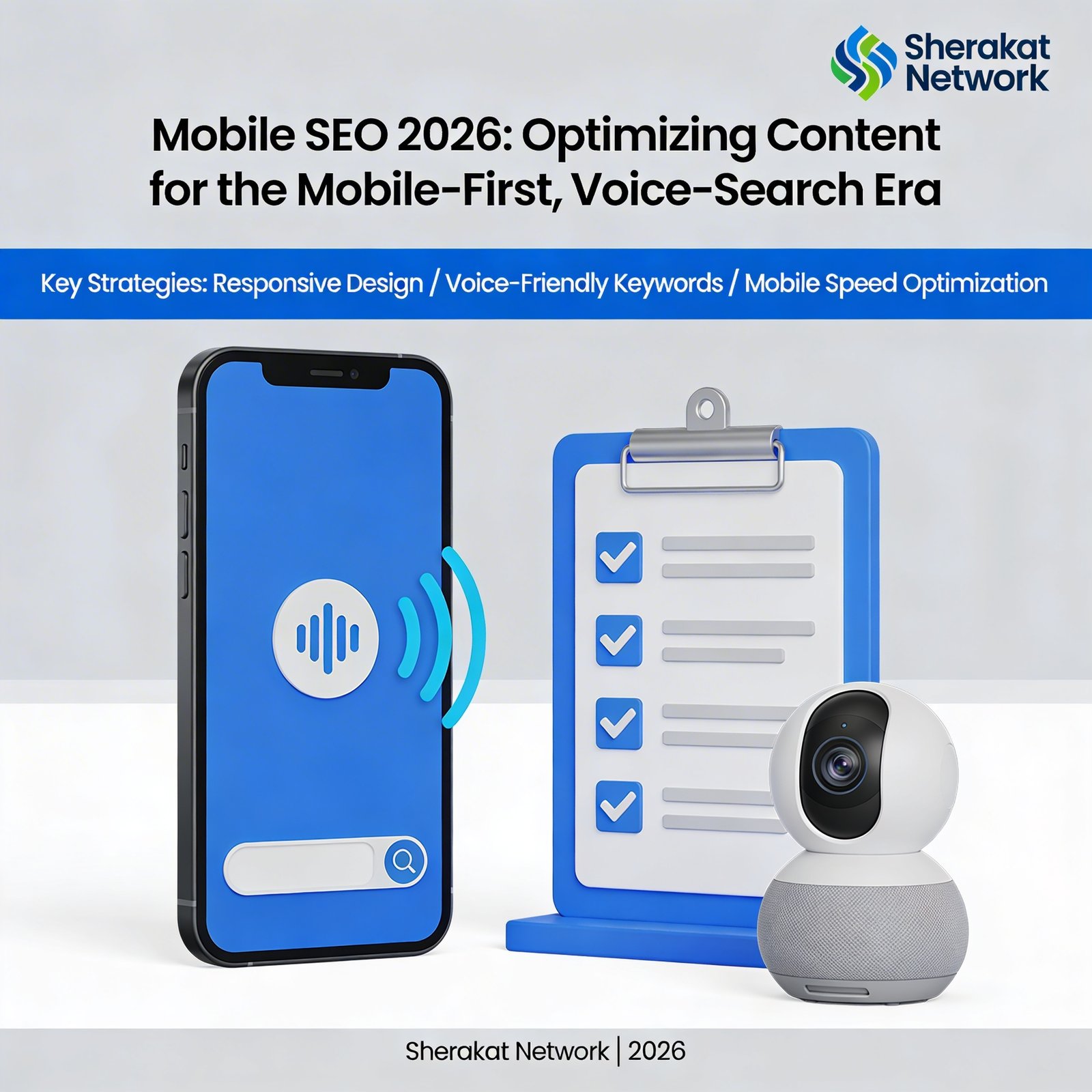
For the Sherakat Network audience—whether you’re a curious beginner who has never thought about mobile SEO, or a seasoned professional needing a refresher on 2026 best practices—understanding mobile SEO is no longer optional. It’s mandatory. Google uses mobile-first indexing, meaning it primarily uses the mobile version of your site for ranking and indexing. If your mobile site is broken, your SEO is broken.
Before we dive deep, I highly recommend reading our previous guides in this series. Each one connects to mobile SEO:
- Topic Clusters: Moving Beyond Keywords to Build Authority in 2026 — Mobile users need clear, scannable topic structures
- The Art of Content Refreshing: How to Update Old Blog Posts for a 200% Traffic Boost — Refreshing content includes mobile optimization
- The Beginner’s Guide to Semantic SEO: Optimizing for Search Intent, Not Just Keywords — Mobile search intent often differs from desktop
- EEAT for Content Creators: How to Demonstrate Experience, Expertise, Authoritativeness, and Trustworthiness — Mobile users need trust signals that work on small screens
- Content SEO for the AI Era: How to Write for Humans While Optimizing for Search Engines — AI can help generate mobile-friendly content formats
- The Art of Internal Linking: The Secret Weapon for SEO Authority in 2026 — Internal linking on mobile requires different considerations
Mobile SEO is the lens through which all these strategies must be viewed in 2026. More than 60% of all web traffic now comes from mobile devices. If your content isn’t optimized for mobile, you’re invisible to the majority of your potential audience.
Background / Context
To understand mobile SEO in 2026, we need to look at the evolution of mobile search and Google’s response.
Phase 1: The Desktop Era (1990s-2010)
For the first two decades of the web, the desktop was king. Websites were designed for large screens, mice, and keyboards. Mobile versions, if they existed at all, were stripped-down afterthoughts. Google indexed the desktop version of sites.
Phase 2: The Rise of Mobile (2010-2015)
Smartphones exploded in popularity. Mobile traffic began to rival desktop traffic. Google realized it had a problem: the desktop sites it was indexing were often unusable on mobile devices. Users were having terrible experiences.
Phase 3: Mobile-Friendly Update (2015)
Google launched “Mobilegeddon”—an update that gave ranking boosts to mobile-friendly pages. Suddenly, having a responsive design or mobile version mattered for SEO. But indexing is still primarily used on the desktop version.
Phase 4: Mobile-First Indexing (2018-2021)
Google began rolling out mobile-first indexing, meaning it would primarily use the mobile version of a site for ranking and indexing. By 2021, mobile-first indexing was enabled for all new websites. By 2023, it was the default for almost all sites.
Phase 5: Core Web Vitals and Page Experience (2021-2024)
Google introduced Core Web Vitals—metrics measuring loading performance, interactivity, and visual stability. These became ranking factors, with particular importance for mobile. Page experience updates continued through 2024.
Phase 6: Voice Search and Mobile AI (2025-2026)
Today, mobile SEO encompasses voice search optimization, mobile-specific intent, and AI-driven search features like SGE (Search Generative Experience) on mobile devices. Mobile search behavior differs significantly from desktop, and Google’s algorithms reflect this.
According to a 2026 report from Statista, mobile devices now account for 63% of all web traffic globally. In some regions and industries, mobile share exceeds 80%. Desktop is no longer the primary platform—it’s the secondary one.
For a deeper understanding of how technology is transforming user behavior, explore the Artificial Intelligence & Machine Learning section on WorldClassBlogs.
Key Concepts Defined
Let’s establish a clear vocabulary for mobile SEO.
Mobile-First Indexing
Mobile-first indexing means Google primarily uses the mobile version of your website’s content for indexing and ranking. Even if a user searches from a desktop computer, Google uses the mobile version of your site to determine rankings. This has been the default for all sites since 2023.
Responsive Design
Responsive design is a web development approach where a single website automatically adjusts its layout and content to fit the screen size of the device being used. Responsive design is Google’s recommended approach for mobile SEO because it uses a single URL and the same HTML across devices.
Dynamic Serving
Dynamic serving uses the same URL but serves different HTML based on the user’s device (detected via user-agent). While acceptable, it’s more complex than responsive design and can lead to errors if not implemented correctly.
Separate Mobile URLs (m dot)
A separate mobile site uses a different URL (e.g., m.example.com) for mobile users. This approach is not recommended by Google because it requires maintaining two separate sites and can create duplicate content issues.
Core Web Vitals
Core Web Vitals are a set of metrics that measure real-world user experience:
- Largest Contentful Paint (LCP): Loading performance (should be under 2.5 seconds)
- Interaction to Next Paint (INP): Interactivity (should be under 200 milliseconds)
- Cumulative Layout Shift (CLS): Visual stability (should be under 0.1)
Mobile Usability
Mobile usability refers to how easy it is for users to interact with your site on a mobile device. Key factors include: tap targets (buttons and links) being large enough, text being readable without zooming, content fitting the screen without horizontal scrolling, and no unplayable content.
Voice Search
Voice search is the practice of using spoken queries to search the web via virtual assistants like Google Assistant, Siri, or Alexa. Voice queries tend to be longer, more conversational, and often phrased as questions.
Local Mobile Intent
Mobile searches often have local intent—users looking for businesses, services, or information near their current location. “Near me” searches have grown dramatically and are almost exclusively mobile.
AMP (Accelerated Mobile Pages)
AMP was Google’s project to create ultra-fast loading mobile pages. While AMP has been largely deprioritized (2021-2024), the principles of fast loading remain critical. Most sites no longer need dedicated AMP versions.
Mobile Page Speed
Mobile page speed refers to how quickly your content loads on mobile devices. Mobile networks are often slower than desktop connections, making mobile page speed optimization even more important than desktop optimization.
For foundational knowledge on building your online presence, visit the Resources section on Sherakat Network.
How It Works (Step-by-Step Breakdown)

Mobile SEO requires a systematic approach covering technical optimization, content adaptation, and user experience. Here’s my step-by-step framework.
Step 1: Verify Your Site Is Mobile-Friendly
Before you can optimize, you need to know where you stand.
Use Google’s Mobile-Friendly Test:
Google provides a free tool at search.google.com/test/mobile-friendly. Enter your URL and run the test. It will tell you:
- Whether your page is mobile-friendly
- Any mobile usability issues (text too small, tap targets too close, content wider than the screen)
- How Googlebot views your page
Run the Test on Multiple Page Types:
Don’t just test your homepage. Test your:
- Blog posts (especially long-form content)
- Product or service pages
- Contact and about pages
- Category or archive pages
- Checkout or form pages
Common Issues the Test Finds:
- Text too small to read (should be at least 16px for body text)
- Tap targets too close together (buttons and links should have enough space)
- Content wider than the screen (requires horizontal scrolling)
- Viewport not configured (the meta viewport tag is missing or incorrect)
- Unplayable content (Flash or other unsupported formats)
Key Takeaway: If you fail the mobile-friendly test, fix these issues before doing anything else. Nothing else matters if your site isn’t basically usable on mobile.
Step 2: Optimize Core Web Vitals for Mobile
Core Web Vitals are ranking factors with particular importance for mobile.
Measure Your Current Core Web Vitals:
Use Google Search Console’s “Core Web Vitals” report. It shows you:
- Which pages have “Good,” “Need Improvement,” or “Poor” ratings
- Specific issues affecting LCP, INP, and CLS
- Mobile vs. desktop performance (often different)
Optimize Largest Contentful Paint (LCP) – Loading Speed:
LCP measures when the largest content element (usually an image or text block) becomes visible. Target: under 2.5 seconds.
How to Improve LCP:
- Optimize and compress images (use WebP format, compress with tools like Squoosh or ImageOptim)
- Implement lazy loading for images below the fold (loading=”lazy” attribute)
- Remove large, unnecessary JavaScript and CSS
- Use a Content Delivery Network (CDN) to serve content faster
- Upgrade your hosting (shared hosting is often too slow)
- Minimize render-blocking resources
Optimize Interaction to Next Paint (INP) – Interactivity:
INP measures how quickly your page responds to user interactions (taps, clicks, keyboard inputs). Target: under 200 milliseconds.
How to Improve INP:
- Break up long JavaScript tasks (over 50ms)
- Optimize event handlers (avoid heavy processing on input events)
- Use web workers for non-UI tasks
- Minimize main thread work
- Defer or remove non-critical JavaScript
Optimize Cumulative Layout Shift (CLS) – Visual Stability:
CLS measures how much your page layout shifts unexpectedly during loading. Target: under 0.1.
How to Improve CLS:
- Always set width and height attributes on images and videos
- Reserve space for ads and embeds (don’t let them dynamically inject)
- Avoid adding content above existing content (except in response to user input)
- Use transform animations instead of properties that trigger layout (like width, height, margin)
Key Insight: A fast-loading, stable, responsive mobile page directly improves user experience. Google knows this and rewards it.
Step 3: Optimize Content for Mobile Consumption
Content that works on desktop often fails on mobile. Mobile users have different needs, attention spans, and behaviors.
Use Shorter Paragraphs:
Desktop users can handle dense paragraphs. Mobile users cannot. On a small screen, a 5-sentence paragraph becomes a wall of text.
Best Practice:
- 1-3 sentences per paragraph
- Break up long paragraphs regularly
- Use line breaks to create white space
Example:
Instead of: “Mobile SEO is the practice of optimizing websites for mobile devices. It includes technical factors like page speed and responsive design as well as content factors like shorter paragraphs and scannable headings. Mobile-first indexing means Google primarily uses the mobile version of your site for ranking.”
Write: “Mobile SEO optimizes websites for mobile devices. It includes technical factors like page speed and responsive design. Content factors like shorter paragraphs also matter. Mobile-first indexing means Google uses your mobile site for ranking.”
Use Scannable Headings and Subheadings:
Mobile users scan more than they read. Clear headings help them find what they need.
Best Practice:
- Use H2s every 200-300 words
- Use H3s and H4s to break down complex sections
- Make headings descriptive (not clever or vague)
Optimize for Thumbs:
Mobile users navigate with their thumbs. The “thumb zone” is the lower half of the screen, where thumbs can reach easily.
Best Practice:
- Place important buttons and links within thumb reach
- Ensure tap targets are at least 48×48 pixels
- Provide at least 8 pixels of space between tap targets
- Avoid placing critical elements in hard-to-reach corners
Use Bulleted and Numbered Lists:
Lists are easier to scan on mobile than paragraphs. Use them for:
- Key takeaways
- Steps in a process
- Features or benefits
- Comparisons
Keep Sentences and Words Short:
Mobile screens are small. Long sentences become harder to track from line to line.
Best Practice:
- Aim for average sentence length under 20 words
- Use simple vocabulary (avoid jargon when possible)
- Break compound sentences into shorter ones
Show Key Information First (Inverted Pyramid):
Mobile users often don’t scroll far. Put the most important information near the top.
Best Practice:
- Summarize the article’s value in the first 100 words
- Put key takeaways near the top
- Don’t bury important information below multiple screens of content
Use Collapsible Sections (Accordions) for Long Content:
For very long content (FAQs, detailed specifications, multiple options), use collapsible sections. This keeps the page shorter while still providing depth.
Example:
An FAQ section with 20 questions. Show the first 3-5 questions open. The rest are collapsed under “Show more” buttons.
Step 4: Optimize for Voice Search on Mobile
Voice search is growing rapidly, especially on mobile. Optimizing for voice requires a different approach than text search.
Understand How Voice Queries Differ:
Voice queries are:
- Longer: “What’s the best Italian restaurant near me that’s open now?” vs. “Italian restaurant”
- More conversational: “How do I fix a leaky faucet?” vs. “fix leaky faucet”
- Often phrased as questions: Who, what, where, when, why, how
- More likely to have local intent: “Near me,” “open now,” “in [city]”
Target Question Keywords:
Optimize content for specific question phrases. Use tools like AnswerThePublic, AlsoAsked, or Google’s “People Also Ask” boxes to find common questions.
Examples of Question Keywords:
- “How do I start an online business?”
- “What is the best time to post on Instagram?”
- “Why is my website not showing up on Google?”
- “Where can I find affordable SEO tools?”
Create FAQ Sections That Answer Questions Directly:
FAQ sections are perfect for voice search because they provide direct, concise answers to specific questions.
Best Practice for FAQ Sections:
- Each question should be an H3 or H4
- Answer directly in 1-3 sentences (voice assistants often read the first sentence)
- Add FAQ schema markup to help Google understand the structure
- Aim for 10-20 questions per pillar page
Example:
H3: “How do I check if my site is mobile-friendly?”
Answer: “Use Google’s free Mobile-Friendly Test tool at search.google.com/test/mobile-friendly. Enter your URL and the tool will tell you if your page passes and list any issues to fix.”
Use Natural, Conversational Language:
Write the way people speak. Use contractions (“it’s” not “it is”), start sentences with “And” or “But” occasionally, and avoid overly formal language.
Example:
Instead of: “One must ensure that their website loads quickly to provide an optimal user experience.”
Write: “You need your site to load fast. Slow sites frustrate mobile users and hurt your rankings.”
Optimize for “Near Me” Searches:
For local businesses, “near me” searches are critical. Ensure your site is optimized for local mobile intent.
Best Practice for Local Mobile:
- Claim and verify your Google Business Profile
- Ensure your NAP (Name, Address, Phone) is consistent across the web
- Add local keywords to your content (“best pizza in Brooklyn”)
- Embed a mobile-friendly Google Map on your contact page
- Encourage and respond to customer reviews
Step 5: Optimize Images and Media for Mobile
Images and media are often the biggest culprits in slow mobile performance.
Use Modern Image Formats:
WebP and AVIF offer better compression than JPEG and PNG. Switch to these formats for all new images.
Example:
A JPEG image at 100KB can become a WebP image at 40KB with the same visual quality. This significantly improves mobile load times.
Compress Images Aggressively:
Use tools like:
- Squoosh (free, browser-based)
- ImageOptim (Mac)
- TinyPNG/TinyJPG (free, web-based)
- ShortPixel (WordPress plugin)
Set Appropriate Dimensions:
Don’t serve a 2000px wide image to a 375px wide mobile screen. Use responsive images with the srcset attribute.
Example Srcset Code:
html
<img src="image-800.jpg"
     srcset="image-400.jpg 400w,
             image-800.jpg 800w,
             image-1200.jpg 1200w"
     sizes="(max-width: 600px) 400px,
            (max-width: 1200px) 800px,
            1200px"
     alt="Description of image">
Implement Lazy Loading:
Lazy loading delays loading images until they’re about to enter the viewport. This speeds up initial page load.
Simple Lazy Loading:
Add loading="lazy" to your img tags.
html
<img src="image.jpg" alt="Description" loading="lazy">
Avoid Autoplay Videos with Sound:
Autoplay videos with sound are hated by mobile users and blocked by many mobile browsers. If you use video:
- Set autoplay to muted
- Use a poster image (preview image) before play
- Let users choose to play (don’t force it)
Step 6: Simplify Mobile Navigation and Internal Linking
Mobile navigation requires a different approach than desktop.
Use a Hamburger Menu (But Understand Its Trade-offs):
A hamburger menu (three horizontal lines) saves screen space but hides navigation options. For most mobile sites, it’s the right choice. However, ensure:
- The hamburger icon is clearly visible and tap-friendly
- The menu opens quickly (no slow animations)
- Important pages (home, search, contact, cart) are also visible outside the menu
Implement a Sticky Header or Bottom Bar:
A sticky header keeps key navigation elements visible as users scroll. A bottom bar (often called a “mobile tab bar”) puts key actions within thumb reach.
Common Bottom Bar Elements:
- Home
- Search
- Categories/Menu
- Cart (for e-commerce)
- Account/Profile
- Contact/Call
Optimize Internal Links for Thumbs:
Revisit our Internal Linking guide with mobile in mind:
- Ensure link tap targets are at least 48×48 pixels
- Provide space between links (at least 8 pixels)
- Avoid links that are too close to the edge of the screen
- Use descriptive anchor text (even more important on mobile where context is limited)
Use Breadcrumbs:
Breadcrumbs help mobile users understand where they are and navigate back. Ensure they’re:
- Clickable (tap targets)
- Not too small (at least 44px tall)
- Placed near the top of the content
Simplify Forms for Mobile:
Forms are notoriously difficult on mobile. Optimize them:
- Use input types that trigger the right keyboard (type=”email”, type=”tel”, type=”number”)
- Minimize required fields (ask for only what you absolutely need)
- Use large tap targets for submit buttons
- Provide clear error messages (not just red borders)
- Test forms thoroughly on actual devices
Step 7: Implement Mobile-Specific Structured Data
Structured data (schema markup) helps Google understand your content. Some schema types are particularly valuable for mobile.
Use Mobile-Specific Schema Types:
| Schema Type | Mobile Value | Best For |
|---|---|---|
| LocalBusiness | “Near me” search, local packs | Local businesses |
| Product | Shopping results, price/availability | E-commerce |
| FAQ | Voice search answers, rich snippets | FAQs, help content |
| HowTo | Step-by-step instructions, recipe cards | Tutorials, recipes |
| Event | Event listings with date/time/location | Events, webinars |
| Review | Star ratings in search results | Products, services |
Implement FAQ Schema for Voice Search:
FAQ schema explicitly tells Google which content is a question and which is the answer. This is powerful for voice search.
Example FAQ Schema (JSON-LD):
json
{
  "@context": "https://schema.org",
  "@type": "FAQPage",
  "mainEntity": [{
    "@type": "Question",
    "name": "How do I make my site mobile-friendly?",
    "acceptedAnswer": {
      "@type": "Answer",
      "text": "Use Google's Mobile-Friendly Test tool, implement responsive design, optimize images, and ensure tap targets are large enough."
    }
  }]
}
Use HowTo Schema for Step-by-Step Content:
HowTo schema helps Google understand instructional content, making it eligible for rich results (often shown as carousels on mobile).
Step 8: Test on Real Mobile Devices
Emulators and simulators are helpful, but they’re not enough. You must test on real devices.
Create a Device Testing Lab:
At minimum, test on:
- An iPhone (recent model, small screen like iPhone SE or 12/13 mini)
- A large Android phone (Samsung Galaxy or Google Pixel)
- A tablet (iPad or Android tablet)
- An older device (to test performance on slower hardware)
Test Different Network Conditions:
Use Chrome DevTools to simulate:
- 4G (moderate speed)
- 3G (slow, but still used in some areas)
- Offline (to see what happens with no connection)
Real User Monitoring (RUM):
Use tools like Google Analytics, Cloudflare, or SpeedCurve to see how real users experience your site on their actual devices.
Key Metrics to Monitor:
- Page load time by device type
- Bounce rate by device type
- Conversion rate by device type
- Error rates by device type
Step 9: Prioritize Mobile Page Speed
Mobile page speed is a ranking factor and a user experience imperative.
Measure Mobile Page Speed:
Use these tools:
- Google PageSpeed Insights: Shows lab and field data for mobile and desktop
- Lighthouse: Built into Chrome DevTools, gives detailed performance audits
- WebPageTest: Advanced testing from multiple locations and devices
Key Speed Targets for Mobile:
- First Contentful Paint (FCP): under 1.8 seconds
- Largest Contentful Paint (LCP): under 2.5 seconds
- Time to Interactive (TTI): under 3.5 seconds
- Total Blocking Time (TBT): under 200 milliseconds
Common Mobile Speed Fixes:
- Minimize JavaScript (remove unused code, defer non-critical JS)
- Optimize CSS (inline critical CSS, defer non-critical CSS)
- Use a CDN (Content Delivery Network)
- Enable compression (Gzip or Brotli)
- Reduce server response time (upgrade hosting, use caching)
- Eliminate render-blocking resources
- Preconnect to required origins
- Preload important requests
For a deeper understanding of how technology is changing user expectations, explore the Technology & Innovation section on WorldClassBlogs.
Why It’s Important
Mobile SEO isn’t a nice-to-have. It’s a must-have. Here’s why.
1. Mobile-First Indexing Is the Default:
Since 2023, Google has used the mobile version of your site for indexing and ranking. If your mobile site is broken, your rankings are broken—even for desktop searches.
2. Majority of Traffic Is Mobile:
Over 60% of web traffic comes from mobile devices. In some industries (local search, food, entertainment, news), mobile share exceeds 80%. Ignoring mobile means ignoring most of your potential audience.
3. Mobile Users Have Less Patience:
53% of mobile users will leave a page if it takes more than 3 seconds to load. Desktop users are more forgiving (but not much). Speed matters more on mobile.
4. Voice Search Is Mobile-First:
Almost all voice searches happen on mobile devices. If you want to capture voice search traffic, you need mobile-optimized, conversational content.
5. Local Search Is Mobile-Dominated:
“Near me” searches have grown by over 500% in the last five years. These searches are almost exclusively mobile. Local businesses cannot afford to ignore mobile.
6. Mobile User Experience Is a Ranking Factor:
Core Web Vitals and mobile usability are explicit ranking factors. Poor mobile experience directly hurts your rankings.
7. Mobile SEO Affects All Other SEO Efforts:
Your topic clusters need to be scannable on mobile. Your refreshed content needs mobile-friendly formatting. Your semantic SEO needs to account for voice search. Your EEAT signals need to be visible on small screens. Your AI-era content needs to be digestible on mobile. Your internal links need to be thumb-friendly. Mobile SEO is the foundation for everything else.
According to a 2026 study by Backlinko, the average mobile page takes 15.3 seconds to load fully. Sites that load in under 3 seconds capture significantly more traffic, engagement, and conversions.
For insights on maintaining productivity while managing complex technical projects, explore this guide on remote work productivity.
Sustainability in the Future
Mobile SEO will only become more important as technology evolves.
The Rise of 5G and Beyond:
5G networks promise faster speeds and lower latency. However, not all users have 5G, and network conditions vary. Optimizing for slower connections ensures you serve all users, not just those on premium networks.
Foldable and Dual-Screen Devices:
Foldable phones and dual-screen devices create new design challenges. Content must adapt to different screen sizes and orientations. Responsive design is more important than ever.
Mobile-First, Desktop-Secondary:
The trend toward mobile-first will continue. Some sites may even become mobile-only, with desktop versions deprecated. Planning for a mobile-first future is prudent.
Voice and Multimodal Search:
Voice search will grow, and multimodal search (combining voice, text, images, and video) will emerge. Optimizing for conversational, question-based content positions you for this future.
AI and Mobile Personalization:
AI will enable more personalized mobile experiences. Search results may vary based on device, location, time, and user history. Optimizing for relevance and context will be key.
For a broader perspective on global trends affecting digital strategy, explore the Climate Policy & Agreements section on WorldClassBlogs.
Common Misconceptions
Let me clear up some persistent myths about mobile SEO.
Misconception 1: “Mobile SEO Is Just About Having a Responsive Design”
False. Responsive design is important, but mobile SEO also includes page speed, Core Web Vitals, mobile-friendly content formatting, voice search optimization, local intent, and mobile-specific structured data.
Misconception 2: “Desktop Rankings Are Separate from Mobile Rankings”
False. With mobile-first indexing, Google uses your mobile site to determine rankings for all searches—including desktop. There’s no separate mobile ranking system.
Misconception 3: “AMP Is Required for Mobile SEO”
False. Google has deprecated AMP as a requirement. While AMP pages may still appear in some features, you don’t need AMP for mobile SEO. Focus on Core Web Vitals instead.
Misconception 4: “Mobile Users Will Scroll Just Like Desktop Users”
False. Mobile users scroll less and bounce faster. If key information isn’t visible near the top, many users will leave. Put important content above the fold.
Misconception 5: “My Site Loads Fast on Desktop, So It’s Fine on Mobile”
False. Mobile networks are often slower than desktop connections. Mobile devices have less processing power. A site that loads in 1 second on desktop might take 5 seconds on mobile. Test on mobile.
Misconception 6: “Voice Search Is a Fad”
False. Voice search adoption continues to grow. Over 40% of adults use voice search daily. As voice recognition improves, usage will increase.
Recent Developments (2025-2026)
Mobile SEO has seen several important developments in the past year.
Mobile-First Indexing Complete:
As of early 2025, Google has fully transitioned to mobile-first indexing for all websites. There is no opt-out. Your mobile site is your primary site.
Core Web Vitals Update:
Google refreshed Core Web Vitals thresholds in late 2025, making the “Good” rating slightly harder to achieve. INP replaced FID as the interactivity metric for all sites.
SGE on Mobile:
Search Generative Experience (SGE) launched on mobile with voice input capabilities. SGE results prioritize content that is mobile-friendly, fast-loading, and conversational.
“Near Me” Algorithm Update:
Google updated its local search algorithm to better understand implicit local intent. Searches like “coffee” (without “near me”) now show local results on mobile by default.
Mobile-First Content Formats:
Short-form video (Reels, Shorts, TikTok) and vertical video have become dominant content formats on mobile. Google has begun prioritizing these formats in mobile search results.
For insights on how culture and society are shaping technology adoption, explore the Culture & Society section on WorldClassBlogs.
Success Stories (If Applicable)
Let me share a detailed case study of a site that transformed its performance through mobile SEO.
Case Study: The E-commerce Store That Tripled Mobile Revenue
An e-commerce client selling outdoor gear had a beautiful desktop site with detailed product pages, high-resolution images, and complex filtering options. Their desktop conversion rate was solid at 3.5%. Their mobile conversion rate was abysmal at 0.5%. Mobile traffic was growing, but revenue was stagnant.
The Problem:
When we analyzed their mobile experience:
- Product pages took 7-9 seconds to load on 4G
- The “Add to Cart” button was below the fold on most phones
- Checkout required pinching and zooming to fill out forms
- Image galleries were unusable on small screens
- The filtering system (30+ options) was impossible to use on mobile
The Mobile SEO Strategy:
We implemented a comprehensive mobile optimization plan:
- Speed Optimization: Compressed images (WebP), implemented lazy loading, removed unnecessary JavaScript, upgraded hosting, added a CDN. Mobile load time dropped from 8 seconds to 2.5 seconds.
- Mobile-First Design: Redesigned product pages for mobile-first, with “Add to Cart” prominently placed above the fold, thumb-friendly buttons, and simplified checkout.
- Mobile-Friendly Content: Shortened product descriptions, used bullet points instead of paragraphs, added expandable “Details” sections for specifications.
- Voice Search Optimization: Added FAQ sections answering common product questions, optimized for “near me” (they had a physical store), implemented HowTo schema for product usage guides.
- Simplified Navigation: Replaced complex filtering with simple category buttons, added prominent search, implemented a bottom navigation bar.
- Mobile Payment Integration: Added Apple Pay, Google Pay, and PayPal Express to simplify mobile checkout.
The Results:
- Month 1-2: Mobile load time improvements implemented
- Month 3: Mobile traffic increased 20% (better rankings)
- Month 4: Mobile conversion rate increased from 0.5% to 1.8%
- Month 6: Mobile conversion rate reached 2.5%
- Month 9: Mobile revenue tripled from baseline
- Month 12: Mobile revenue was 4.5x baseline
Desktop revenue remained steady. All growth came from mobile optimization.
For more success stories and practical resources, visit the Resources section on Sherakat Network.
Real-Life Examples
Let me show you two concrete examples of mobile SEO in action.
Example 1: Desktop-First Content vs. Mobile-Optimized Content
Desktop-First Content (Bad for Mobile):
“Mobile SEO is the practice of optimizing websites for mobile devices. It encompasses a wide range of technical, design, and content factors including responsive design, page speed optimization, Core Web Vitals, mobile-friendly navigation, tap target sizing, font legibility, viewport configuration, image optimization, lazy loading, structured data implementation, voice search optimization, local search optimization, and mobile-specific user experience considerations. Implementing mobile SEO requires a holistic approach that considers the entire user journey from search to conversion. (300+ word paragraph continues…)
Mobile-Optimized Content (Good for Mobile):
“Mobile SEO optimizes your site for mobile devices.
Key factors include:
- Responsive design
- Page speed
- Core Web Vitals
- Tap-friendly buttons
- Readable text
Why it matters:
Over 60% of web traffic is mobile. Google uses mobile-first indexing.
Let’s dive into each factor…”
Example 2: Voice Search Optimized Content
Not Optimized for Voice:
“To determine if your website is mobile-friendly, there exists a tool provided by Google called the Mobile-Friendly Test. One must navigate to the tool’s URL, input their website address, and initiate the test. The tool will subsequently provide an analysis.”
Optimized for Voice:
Q: How do I check if my site is mobile-friendly?
A: Use Google’s free Mobile-Friendly Test. Just enter your URL and the tool tells you if your page passes.
Conclusion and Key Takeaways
Mobile SEO is no longer a separate discipline from “regular” SEO. It is regular SEO. With mobile-first indexing, the mobile version of your site is the version Google uses to rank you. If your mobile experience is poor, your SEO is poor.
For the Sherakat Network community, this means making mobile optimization a priority—not an afterthought. Test your site on real devices. Optimize your content for small screens and thumbs. Speed up your load times. Prepare for voice search.
Key Takeaways:
- Mobile-first indexing is the default. Google uses your mobile site for ranking. If your mobile site is broken, your rankings are broken.
- Core Web Vitals matter. LCP (under 2.5s), INP (under 200ms), and CLS (under 0.1) are ranking factors. Optimize them.
- Mobile content is different. Use shorter paragraphs, scannable headings, bullet points, and the inverted pyramid. Put key information first.
- Optimize for thumbs. Tap targets should be at least 48×48 pixels with 8 pixels of space. Place important elements in the thumb zone.
- Voice search is growing. Optimize for question keywords, create FAQ sections with schema, and use natural, conversational language.
- Page speed is critical on mobile. 53% of users leave if a page takes over 3 seconds. Compress images, use a CDN, and minimize JavaScript.
- Test on real devices. Emulators aren’t enough. Create a device testing lab and monitor real user data.
- Mobile SEO integrates with all your other strategies. Your topic clusters need to be scannable on mobile. Your refreshed content needs mobile-friendly formatting. Your semantic SEO needs to account for voice search. Your EEAT signals need to be visible on small screens. Your AI-era content needs to be digestible on mobile. Your internal links need to be thumb-friendly. See our guides on Topic Clusters, Content Refreshing, Semantic SEO, EEAT, AI Era Content, and Internal Linking for integration strategies.
For a comprehensive foundation on starting your online journey with mobile in mind, explore our guide on how to start an online business in 2026.
FAQs (Frequently Asked Questions)
- What is mobile-first indexing?
Mobile-first indexing means Google primarily uses the mobile version of your website’s content for indexing and ranking. Even if a user searches from a desktop computer, Google uses the mobile version of your site to determine rankings. - Do I need a separate mobile website (m dot)?
No. Google recommends responsive design (one site that adapts to all devices). Separate mobile URLs (m.example.com) are not recommended because they require maintaining two separate sites and can create duplicate content issues. - What are Core Web Vitals?
Core Web Vitals are metrics measuring real-world user experience: Largest Contentful Paint (LCP, loading speed), Interaction to Next Paint (INP, interactivity), and Cumulative Layout Shift (CLS, visual stability). - What are the Core Web Vitals thresholds for “Good”?
LCP: under 2.5 seconds, INP: under 200 milliseconds, CLS: under 0.1. These are the targets for mobile and desktop. - How do I test if my site is mobile-friendly?
Use Google’s free Mobile-Friendly Test tool at search.google.com/test/mobile-friendly. Also test Core Web Vitals in Google Search Console and PageSpeed Insights. - How fast should my mobile site load?
Under 3 seconds is the target. 53% of mobile users will leave if a page takes over 3 seconds. For LCP specifically, under 2.5 seconds is the “Good” threshold. - What is the ideal font size for mobile?
Body text should be at least 16px. Headings should be larger (20px+). Text that is too small requires pinching and zooming, which creates a poor user experience. - How big should tap targets be on mobile?
At least 48×48 pixels. Buttons and links smaller than this are difficult to tap accurately. Provide at least 8 pixels of space between tap targets. - What is the thumb zone?
The thumb zone is the area of a mobile screen that is easily reachable with your thumb while holding the phone one-handed. It’s generally the lower half of the screen. Place important buttons and links within thumb reach. - How do I optimize images for mobile?
Use modern formats (WebP, AVIF), compress images aggressively, serve appropriately sized images (not desktop-sized to mobile), implement lazy loading, and use responsive images with srcset. - What is lazy loading?
Lazy loading delays loading images and videos until they’re about to enter the viewport. This speeds up initial page load. Addloading="lazy"to your img tags. - How do I optimize for voice search?
Target question keywords (who, what, where, when, why, how), create FAQ sections with direct answers, use natural conversational language, implement FAQ schema, and optimize for “near me” if you’re a local business. - Does voice search have different keywords than text search?
Yes. Voice queries are longer, more conversational, and often phrased as questions. “What’s the best Italian restaurant near me that’s open now?” vs. “Italian restaurant.” - How do I optimize for “near me” searches?
Claim and verify your Google Business Profile, ensure consistent NAP (Name, Address, Phone) across the web, add local keywords to your content, embed a mobile-friendly map, and encourage customer reviews. - What is the difference between responsive design, dynamic serving, and separate URLs?
Responsive design: same URL, same HTML, adapts via CSS (recommended). Dynamic serving: same URL, different HTML based on device. Separate URLs: different URLs (m.example.com) for mobile (not recommended). - Do I need AMP (Accelerated Mobile Pages) for mobile SEO?
No. Google has deprecated AMP as a requirement. Focus on Core Web Vitals and general mobile performance instead. - How does SGE (Search Generative Experience) affect mobile SEO?
SGE prioritizes mobile-friendly, fast-loading, conversational content. FAQ sections, clear headings, and structured data are particularly valuable for SGE citations. - What are common mobile usability issues?
Text too small to read, tap targets too close together, content wider than screen (horizontal scrolling), viewport not configured, unplayable content (Flash), and pop-ups that are hard to close. - How do I fix Cumulative Layout Shift (CLS) on mobile?
Set width and height attributes on images and videos, reserve space for ads and embeds, avoid adding content above existing content, and use transform animations instead of layout-triggering properties. - How do I fix Largest Contentful Paint (LCP) on mobile?
Optimize and compress images, implement lazy loading, remove large JavaScript/CSS, use a CDN, upgrade hosting, and minimize render-blocking resources. - How do I fix Interaction to Next Paint (INP) on mobile?
Break up long JavaScript tasks, optimize event handlers, use web workers, minimize main thread work, and defer or remove non-critical JavaScript. - Should I use a hamburger menu on mobile?
Hamburger menus save screen space but hide navigation options. For most mobile sites, they’re a good choice. Ensure the icon is clearly visible and tap-friendly, and important pages are also accessible outside the menu. - What is a sticky header or bottom bar?
A sticky header remains visible as users scroll. A bottom bar (mobile tab bar) puts key actions within thumb reach. Both improve mobile navigation. - How do I optimize forms for mobile?
Use input types that trigger the right keyboard (type=”email”, type=”tel”), minimize required fields, use large tap targets for submit buttons, provide clear error messages, and test thoroughly on real devices. - What structured data (schema) is most important for mobile?
LocalBusiness (for “near me”), FAQ (for voice search), HowTo (for instructions), Product (for e-commerce), and Event (for events). These can trigger rich results on mobile. - How do I test mobile speed on real devices?
Use Chrome DevTools device emulation, Google PageSpeed Insights (uses real mobile testing), WebPageTest (choose mobile devices), and Real User Monitoring (RUM) from Google Analytics. - Does mobile SEO affect desktop rankings?
Yes. With mobile-first indexing, Google uses your mobile site to determine rankings for all searches—including desktop. If your mobile site is poor, your desktop rankings will suffer. - How often should I test my mobile site?
At minimum, quarterly. Also test after any major site updates, design changes, or plugin installations. Monitor Core Web Vitals in Google Search Console continuously. - What is the most common mobile SEO mistake?
Treating mobile as an afterthought. Designing for desktop first and then “making it work” on mobile leads to poor experiences. Design for mobile first, then scale up to desktop. - What is the single most important thing for mobile SEO?
User experience. A fast, usable, thumb-friendly, readable mobile site will naturally satisfy Google’s mobile-first indexing, Core Web Vitals, and usability requirements. Focus on creating a great mobile experience, and the rankings will follow.
About Author
This guide was written by an SEO strategist and technical SEO consultant with over 12 years of experience. I’ve helped hundreds of sites transition from desktop-first to mobile-first, often with dramatic results. I’ve seen the painful before-and-after of sites that ignored mobile and sites that embraced it. My approach combines technical precision (Core Web Vitals, page speed, structured data) with user-centered design (thumb zones, scannable content, voice search). I believe that mobile SEO is not a separate discipline but the foundation of modern SEO. When I’m not optimizing mobile performance or auditing mobile usability, I’m usually testing the latest mobile devices or reading about human-computer interaction. You can connect with me through the Sherakat Network contact page.
Free Resources

To help you implement mobile SEO on your own website, here are free resources available through Sherakat Network:
- Mobile SEO Audit Checklist: A comprehensive PDF checklist covering responsive design, Core Web Vitals, mobile content formatting, voice search optimization, and mobile usability. Available in our Resources section.
- Core Web Vitals Optimization Guide: A detailed guide to fixing LCP, INP, and CLS issues, with specific code examples and tool recommendations.
- Voice Search Keyword Research Template: A Google Sheets template for finding and organizing question-based keywords for voice search optimization.
- Mobile-Friendly Content Template: A template for reformatting desktop content into scannable, thumb-friendly mobile content.
For insights on building successful business relationships that can support your mobile SEO efforts, explore our guide on business partnerships.
Discussion
Now I want to hear from you:
- Have you tested your site on a real mobile device recently? What did you find?
- What’s your biggest mobile SEO challenge (speed, usability, voice search, something else)?
- Have you seen ranking improvements after improving mobile performance?
Share your experiences, questions, and insights in the comments below. Mobile SEO is a journey, not a destination. Let’s learn from each other.
For ongoing conversations about SEO, content strategy, and digital business, be sure to follow the Sherakat Network blog and explore our SEO category for more in-depth guides.
Everything is very open and very clear explanation of issues. was truly information. Your website is very useful. Thanks for sharing.